I probably started using photo actions about a year ago. I use the free photo actions available from The CoffeeShop Blog (most will work in PSE, and to show your appreciation you can donate to the author to help finance her site). After using actions for a while I started to notice a pattern: using a Screen blending mode will brighten a photo, and using a Soft Light blending mode will boost the colors a bit - two things most of my photos need.
I will step you through an example. I'm working in Photoshop CS4, but the same steps should work in Elements, too. I'm starting with a photo that I took outside in the afternoon shade.
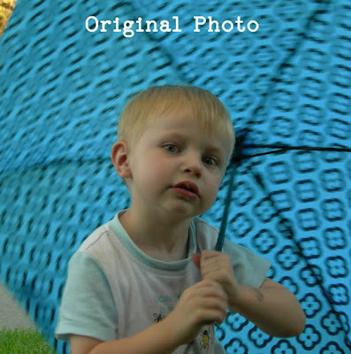
It looks really dark. Two years ago, I wouldn't have thought there was anything wrong with this photo, but today I would not consider it acceptable to put in a layout. Six months ago, I would have thought there was nothing I could do for this horrible dark photo, but that was before I learned about Screen.
The general process to edit a photo is to duplicate the photo on several layers and then apply different blending modes to the new layers. The blending mode is accessed in the Layers Palette. At the top, there is a box, which in the default is set to "Normal." Click on that, and it will pop up a list of about 25 different blending modes you can choose from.
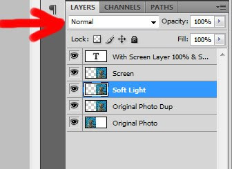
First, I will duplicate the image, and apply a Screen blending mode to the top layer. Here is the result:
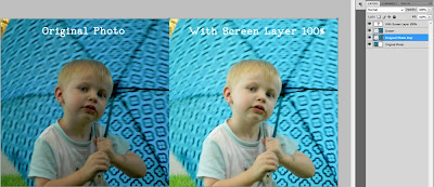
I'd say that is 100% better already. But, it is maybe a little washed out, so now I will go back to my photo layer and duplicate it again, this time applying a Soft Light mode to the newest layer (which is just above the original photo layer):
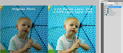
That last step isn't a huge difference for this particular photo, to my eye anyway, but I think it makes him look more real. If any of the effects are too dramatic, you can bring down the opacity of the layer to tame it a bit. On that last Soft Light layer, I would probably take it down to about 60%. On the other hand, if the effect isn't enough, you can make extra copies of the layers. You can also change the layer order. I found that with the Screen layer on top, the combined effect was a bit lighter than having the Screen layer on the bottom.
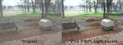
Here is another example of just using the Soft Light layer - to help you get a feel for what it does. This original photo looks real flat and pale, maybe because it was taken through a window screen. It is a picture of my mom's back yard, specifically where her septic tank is. (I won't go into the details of why I took this photo; let's just say we had a stressful couple of days last Christmas.) Here is the photo with two Soft Light layers:
Soft Light works great on black and white photos too. If I were to describe the effect, I would say it darkens the darks and lightens the lights to give a more dramatic look:
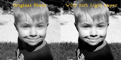
I think the edited black and white above looks a bit more polished, although I suspect that being a newbie at it, I often overdo the editing. It's all a learning process!
That's about all I know about photo editing, and I hope it gives you a nice starting place to begin editing your own photos.

3 comments
Thank you so much for this great post. You are the second blog I've read today offering easy to understand editing tips, that improve the photo without taking it beyond the edge of reality. I just want my photos to look as nice as they can without looking overworked. This was very helpful! Would love to see more like it. Thanks again!
Awesome tutorial Tiff!
Thank you for taking the time to publish this information very useful! highend retouching
Post a Comment