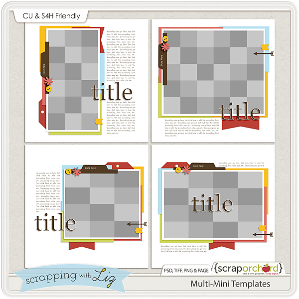
Recently I was inspired to use one of these template with just a
single photo, and I used the multiple grey photo spots as an overlay instead. The kits in this layout are Punkin Papers and Punkin Elements by creashens.
Step 1: Merge the 12 photo clipping layers into a single layer. I selected all twelve of the photo layers in my Layers Palette and right-clicked to Merge the layers. You can also merge layers from the Layer Menu, or using the shortcut Ctrl-E (Photoshop CS4). Photoshop automatically named the combined layer as "Photo 12," which was the name of the top most photo spot.
Step 2: Duplicate the layer. The original copy serves as a clipping mask for my photo, while the duplicate (called "Photo 12 copy") serves as the overlay.
The following screen shot shows my layout with a view of the Layers Palette to the side. You can see the two copies of the merged photo spots. Layer "Photo 12" has my photo clipped to it. "Photo 12 copy" is turned off at the moment, so you just see my photo.
Now, if I turn on the visibility of "Photo 12 copy", it looks like this. My photo is hidden by the overlay.
Step 3: Change the blending mode of the overlay layer to Hard Light:
The overlay becomes transparent, and the various shades of gray result in different opacities. I thought of leaving the photo like this. It sort of veiled the picture, which was appropriate because the costume in the photo is still a work in progress. But the green in the picture clashed a bit with the colors of the kit, so I thought to add some color to the overlay.
Steps 4 & 5: Add a solid fill layer above the overlay and clip it to the overlay. Set the blending mode of the fill layer to Screen. I used the Layer drop-down menu to accomplish this (Layer --- New Fill Layer --- Solid Color) I chose an orange hue from the kit and then played around with darker or lighter shades. A dark shade gave me the look I wanted.
And there you have it.
To achieve the overlapping colors on the edges of the page, I placed solid papers on the edges (sort of "hanging off" the edges) and angled them. Then I changed their blending modes to Multiply or Linear Burn (I experimented with different blending modes to get the look I liked). If any of the overlap between two papers created too dark of a color, I simply erased parts of the paper.
-Tiff


2 comments
Very cool!!
neat ... off to try this!
Post a Comment