We all know Liz makes oodles of wonderful albums for our scrapping needs. Just check out the Snappy Album, the Wedding Guest Book, Simple and Sweet Album 4, and one of my favorites of all time, the original Simple and Sweet Album! For me, Liz's albums allow me to scrap without the stress about layout design. Often Liz's templates inspire me to switch and move things around to make them my own, or to combine them in different ways!
I recently started a layout, and then realized that I didn't have enough of the pictures that I liked from the day but I still had 4 really good photos. So... I re-started the layout and chose a template from the Snappy Album to begin. I was planning to create a double layout from the single layout. You can easily enlarge and change the size of the shapes on a layout. You don't have to worry about the quality of the colors of the shapes because they are used as masks.
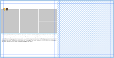
I work with a 12 x 24 blank layout that has my guides set up already. I opened the single template and then duplicated all the layers into my double layout. Here is what it looks like when the template is brought in directly. The 4 picture spots will work perfectly for my pictures. I just want it to cover a 24-inch width rather than the 12 inch.
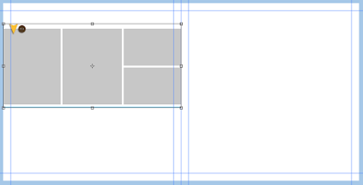
Next, I duplicated the white background layer and then slid it over to the right side of my layout.
After my background was ready, I now wanted to enlarge the photo spots and element placemarks. My original thought was to just enlarge it to cover the whole 24 inches. This is what I had:
A bit too big for what I was thinking. Hmm. I stared at my screen for some time, wondering if I should just try tilting it on an angle or maybe just crop off a little from the top and bottom. I decided to just shrink the photos and elements to about 80%. Once I did this, it was an instant "yep, that works" feeling. I decided to scoot all of the photos and elements to the left and add a spot for journaling. Here is what my layout looked like at this point.
I noticed I needed to lengthen the paper strip on the bottom after I added my journaling box. Once, I added photos, I think it really worked out well!
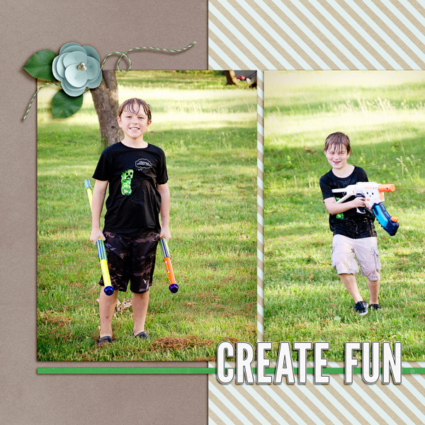
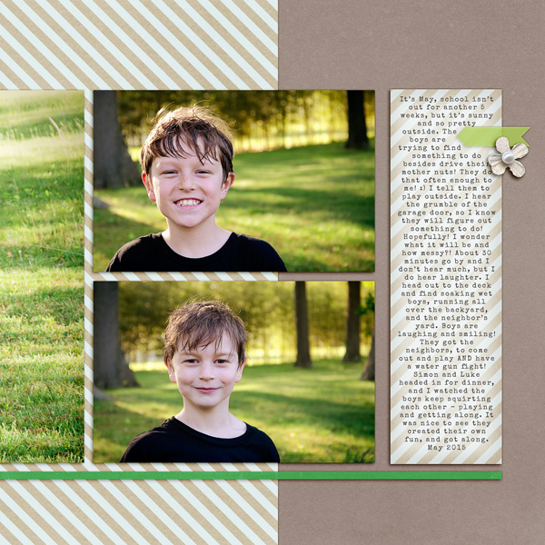
I kept going and this is what my final layout looked like. I used some goodies from Forever Joy's Love You More kit. While I scrapped, I added one more paper layer to the background.
You can still totally see the original single template that the double template was inspired from!
Some things to remember when making a single template into a double layout spread:
- Make all changes to the shapes and placeholders at the beginning of your scrapping.
- Look at the photos spots - enough for your pictures? Do the horizontal or vertical spots work with your photos?
- Follow the element place markers - only when starting. Then add as you go. Layer it up if you like!
- Create something that pleases you and you want to see in one of your albums!
- Have fun - you're stretching your stash!
There you go... my ideas and thoughts about single to double scrapping! I've done this many times before, and my pages always seem to be favorites.
Have fun and thanks for visiting!
Jenn (jk703)


1 comment
Wonderful tutorial as always.
Post a Comment