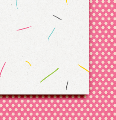
Today, I'm going to be discussing some shadows. Previously, on the Cutting Out Cut Outs post in February, a reader asked about my usual shadow settings. For my images, I'm using papers from Love You Beary Much by Pink Reptile Designs. I'd like to continue to show off different elements and their corresponding shadows. So let me know what shadowing you would like to see in upcoming posts! :) Comment below!
I've been scrapping for a number of years, and when I scrap and like a certain shadow, I tend to save my settings as a new Style, and name it according to what I shadowed. I used to have a blog and called myself The Typative Scrapper, and as I created anything or saved anything, I credited myself. Here are what my shadows look like under the Styles Menu. There are oodles of them, from Acrylic all the way to Zippered Elements, plus different ones for different shadow heights - Small, Medium, Large. By shadow heights, I mean how far and deep they are from the layer below.
First up.... paper. :) In that post, I'm sorry to say that I hadn't saved it as a .psd, but I've tried to recreate the look to share the shadow settings. Here is a similar image to the one from that post, where I've shadowed the cut out "Totally Awesome." In my Styles Menu, I am using what I called Typative Scrapper Paper Opposite Edge Med. This means that I have a regular paper drop shadow (45*), and then I also have an outer glow that shows on the opposite of my drop shadow(-135*).
Here are the specific settings for each:
Drop Shadows: 45*, Distance 20, Spread 1, Size 27, Linear Burn, at 75%.
Outer Glow Shadow: Linear Light, Opacity 17%, Softer size of 10.

You are probably wondering why I have a shadow on the opposite side, and where the heck is it? Well, it is hard to see, so I'm going to try to show you. When you lay a paper flat, it gives off a shadow based on the light above. At the same time, paper does not lay flat. Even with the light, you may see a little bit of shadow on every edge. Here is the paper with the Opposite Edge Shadow aka Outer Glow, and then without. It's very faint, but I feel that sometimes, it really gives my digital layouts a little extra.
Another way to really see the shadow and the opposite, is if I use my Typative Scrapper Paper Opposite Edge Lg. I might use this if I have a bunch of layers below the paper, so it might need to be higher up. You can really see the different in the color of the shadow and a bit more of the opposite edge shadow.
Here are the shadow settings for the Large:
Outer Glow Shadow: Linear Burn, Opacity 30%, Softer size of 38.
There you have it. My paper shadow basics. I would say that I use the Medium with the Opposite Edge most often on my papers. Then again there are times, since I have saved so many, I usually give them all a whirl, and see what my eye likes.Let me know what kinds of shadowing you would like to read about or learn how to do! Thank you for visiting, and have fun scrapping! Jenn/jk703


2 comments
Thanks for the tutorial!
Thanks Jenn :)
I like seeing how people do there shadows. I like how you give the opposite edge that little umph. Thanks again for the tutorial and settings :)
Christa (cffile)
Post a Comment