Hello and Happy Thursday! Here’s hoping today is a great one for you and that you have some time to sit back, grab a cup of coffee, and jump start your mojo! CTM Robin here and today I’d like to inspire you to make some large photo layouts. There’s just something so refreshing about seeing one of these layouts in the midst of all our normal ones. The pictures just catch our eyes and grab our attention. Don’t you agree? Well the beautiful thing is a large photo layout can be made in so many different ways. I’d like to show you some now so you can see what sparks your creativity.
If you want a stunning layout quickly, you can use some of Liz’s Focal Point templates to get you started. Take a peek at this example by djp332.
She used Focal Point 3 and I just love the colors and the way she included some QR codes to capture the moment. I don’t know that I would have been that brave to be out in a tropical storm, but you have to admit her layout is a great one!
Here’s another example by Tiff.
She used Focal Point Templates 5 for her layout. I love that dark background woodgrain paper and how she used white frames to showcase her smaller photos too. It’s simply gorgeous!
These layouts are so pretty, but you can think outside of the box as well. Large photos can be your BACKGROUND. Most cameras today produce photos that can be 12x12 without problems – even phone ones. So take that stunning photo that you love so much and make it the background. Look at this example by Angela Toucan.
She did exactly this but then blended it so it fades away nicely. She then used Edge Templates to go on top of it and added some amazingly talented title work. Lovely!
Tiff started with Recyclables 51, changed her background photo to black and white, made it into the background, and then layered some fun colored photos on top.
It’s a whole different look and really makes her colored ones pop! I love how she mats them too with tiny colored pieces of paper.
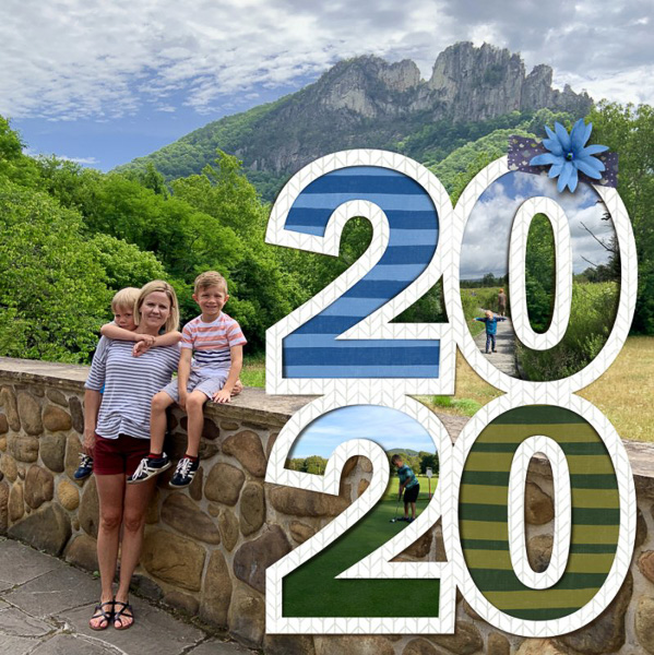
But you don’t have to blend your large photo in. You can leave it loud and proud too. Look at this one by Erin.

She took that gorgeous photo and layered Liz’s 2020 Cover Freebie on top of it and then filled it with photos and papers too. Genius I tell you!!
Now don’t think that large photo layouts mean the photo HAS to be the background. There’s other ways to use them too! Sometimes it’s fun to cover two-thirds of the page with a photo. It’s a really pleasing composition. Take this one by Eyeore for example.
What a fun picture of her pizza! She used Grand Motif templates and then filled the top third with some cute papers and a couple of black and white photos from the evening. I’m telling you this is perfect for restaurant layouts. You know, the ones where the lighting is never flattering and there is so much background clutter?? This way you can show off the yummy food AND those friends and family surrounding you. Beautiful!!
Speaking of family adventures, look at Liz’s layout using Mix ItUp Templates 3.
Like Eyeore, she uses a large photo for the bottom two-thirds of her page, but she mixes cute paper squares and a photo to make the top of the page. I love how she uses scallops and brackets to transition between the two areas and balances them with some embellishments in the corner.
But you don’t have to put your large photo on the bottom though. Try flipping it like navaja77 did.
She put hers on the top two-thirds and then used the 2020Cut Outs and some brushes / stamps to separate the areas. I love her rounded corners and the fact that she left a border around the page too!
Can you see how each of these is so different from the others? I love the versatility here and just know that one of these will surely help you to make your own large photo layout. If it does, I’d love to see your examples. Just put your layout in the comments or link up your photo in your favorite gallery!!


No comments
Post a Comment