Happy June y’all! Here in the States, summer break has begun, but I swear we are busier now with camping, traveling, and touring colleges than we were during the school year! Thankfully I had a moment to make a layout and am here to share with you my step-by-step process.
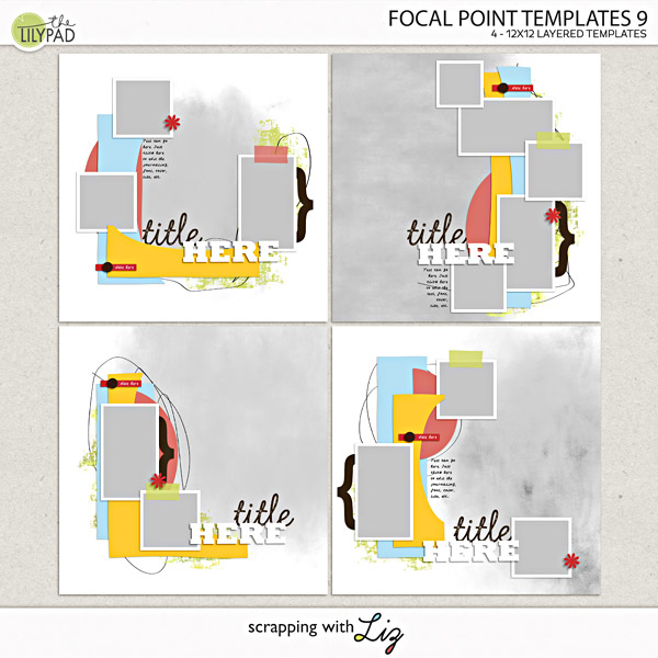
I wanted to make something with Liz’s Focal Point 9
templates since I love this entire series.
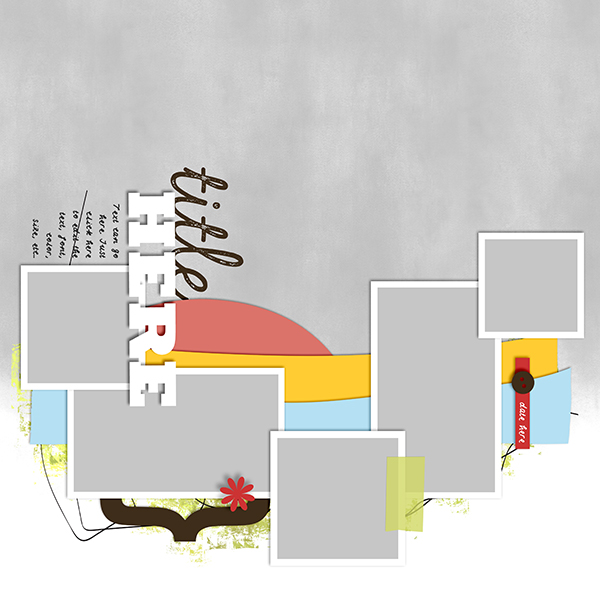
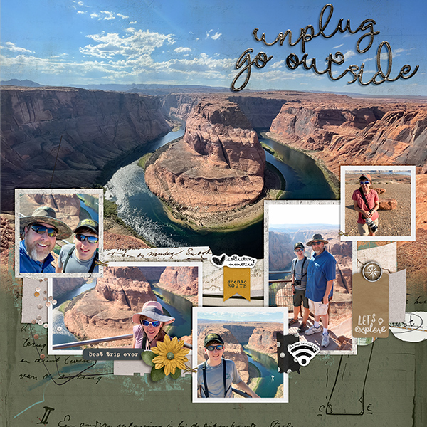
I decided to take template 34 and rotate it 90 degrees clockwise because I knew I had a large, horizontal photo of Horseshoe Bend that I wanted to highlight:
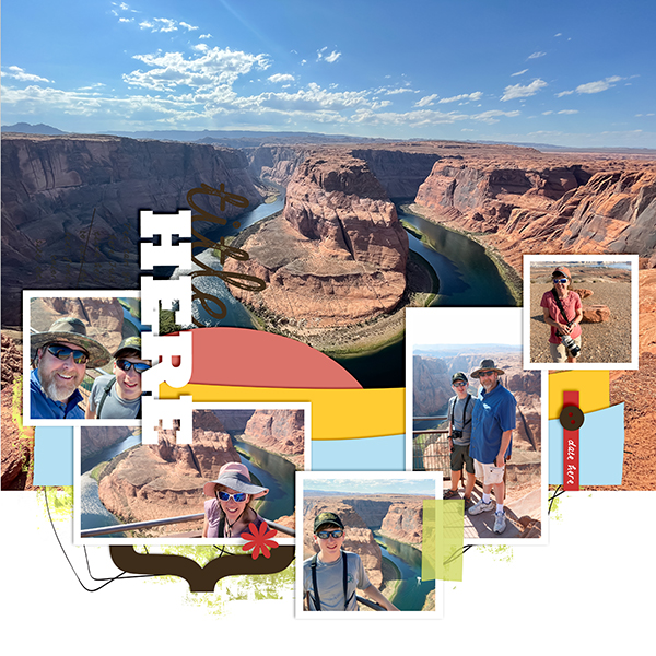
I added all my photos, making sure not to crop anything too important 😊
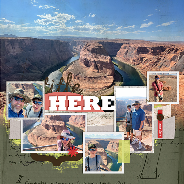
After photos came the papers. I’m using Fernweh which is a
collaboration between Anita Designs and Rachel Jefferies. I love how the colors and theme fit my photos
perfectly.
Next, I had fun playing with a plethora of elements and adding some metal
styles.
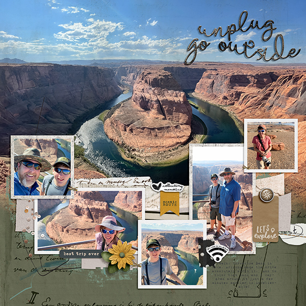
I then added my text and THOUGHT my page was done. However, my teenage son happened to walk by and told me my horizon was crooked on my main photo. Thanks, son. Once I straightened it, I finalized the page by making sure all my shadows were rotated to 45 degrees. This was a necessary step since I rotated the entire template in the beginning, but thankfully it didn’t take long using global shadows!
That’s it. Another travel page done and ready to print for my album. Don’t you just love how easy Liz’s templates making pulling together a page quickly? I hope y'all have a great rest of the month and I'll see you in July with another Step-by-Step!

No comments
Post a Comment